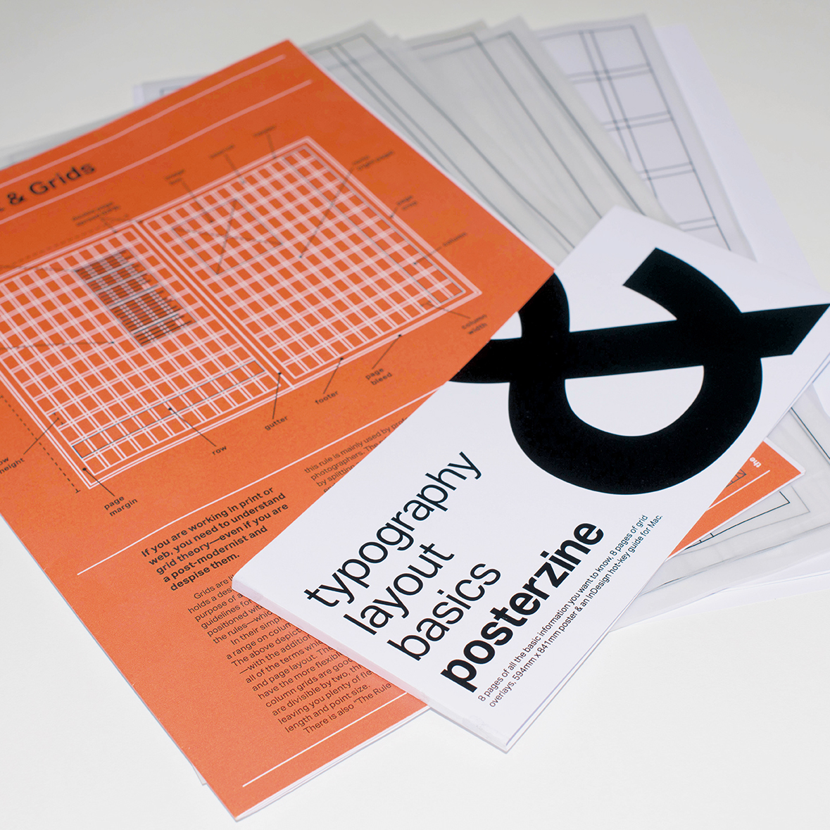
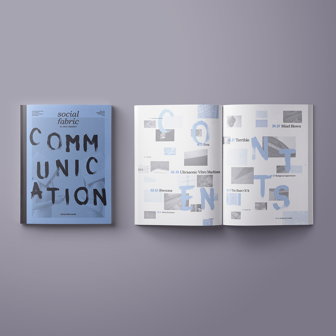
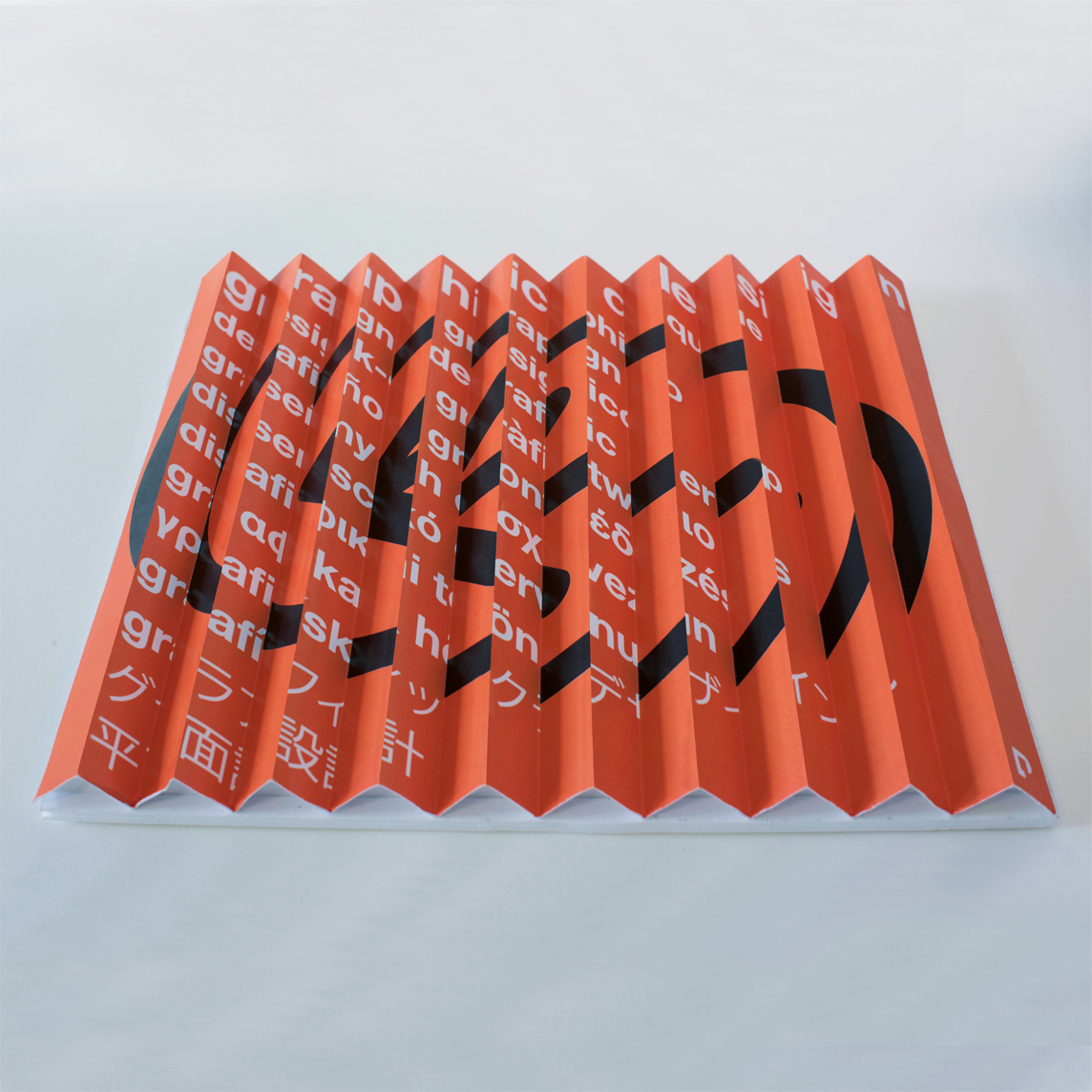
brief / I was given an Ampersand, to which I had to choose an appropriate typeface to represent it. I then had to produce a twelve-page type specimen booklet, with specific content requirements; the typeface, why the typeface choice, the history, hand rendered images, digitally rendered images, 3D object making and final photography. The final print had to be in monotone black and white.
duration / 4 weeks.
role / Concept, design, fabrication & photography.
realisation / I selected Baskerville due to its classification as a transitional typeface and it’s history. The italic Ampersand is a beautiful representation. I cast a 3D concrete bold Baskerville Ampersand, utilising and improving on my previous experience of casting. I also produced a series of bitmap digital renderings, a hybrid human/type Ampersand, illustrations and installation pieces.
