
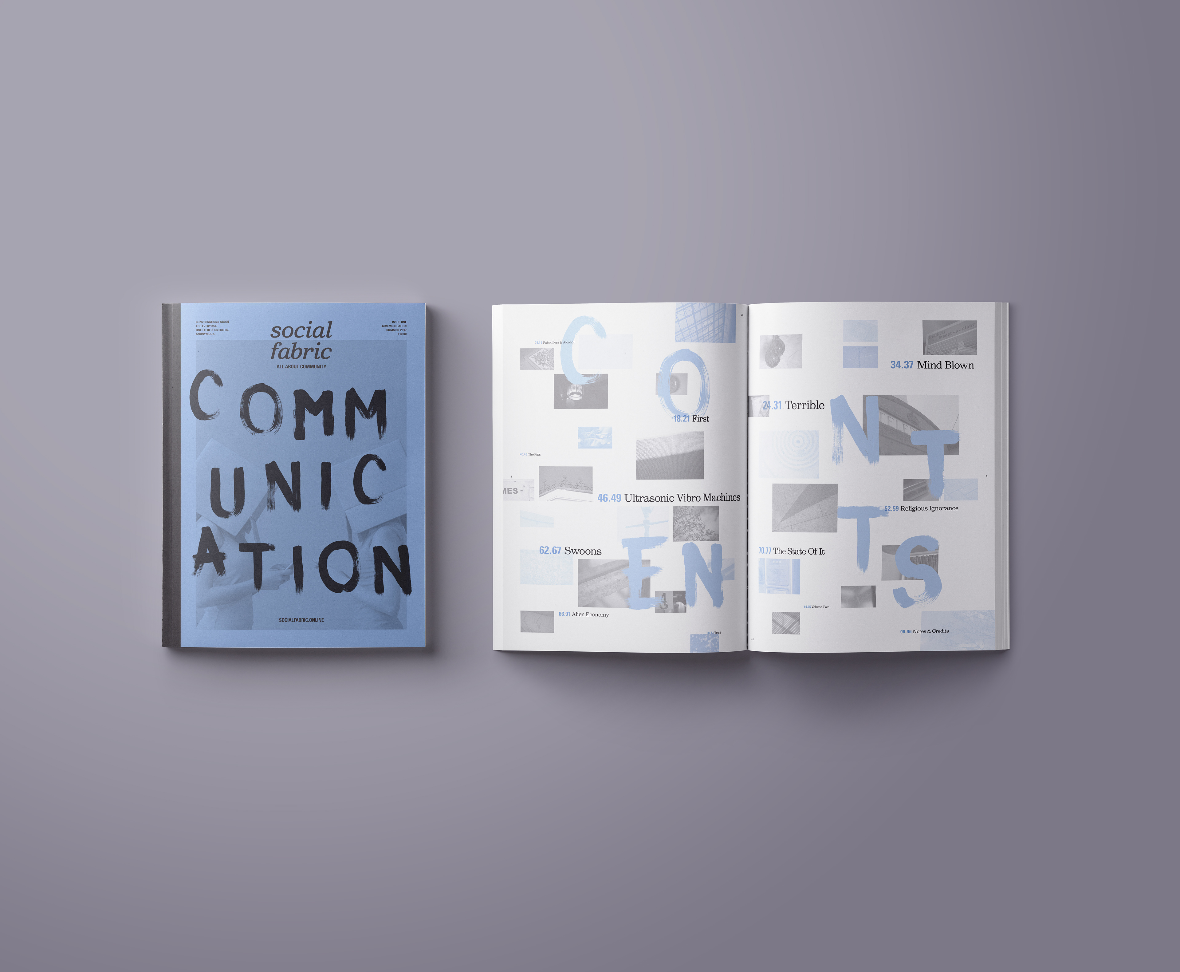
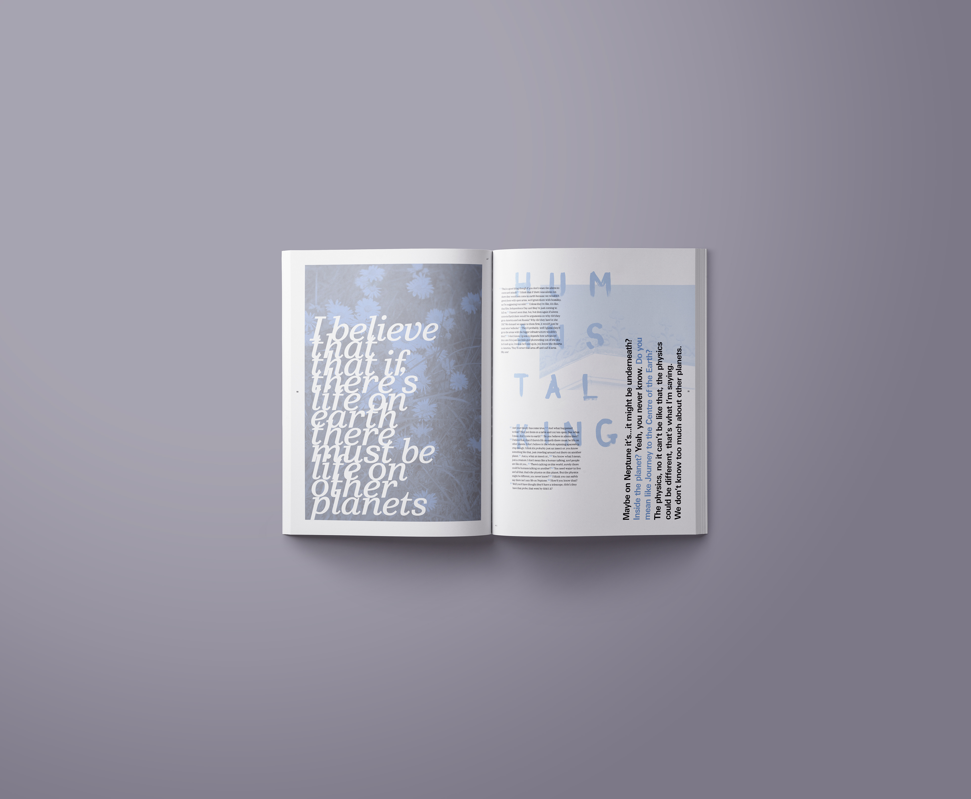
In a world that claims to be more social than ever, are we? Community and appreciating everything around us is more important than ever, which is in some ways the opposite of what’s expected in our fast-paced modern digital lives. Social Fabric is a journal of communication. It is a document of the every day, the quirks of how people talk in the real world and all of the little things that aren’t remembered. It’s about the ways that people communicate when talking to other people is a choice and not a necessity. The idea of a journal, something physical and tactile, is that it will evoke the spirit of the time it was created within. Social Fabric couldn’t rely solely on words, so a very rough and raw form of photography is also employed to catch glimpses of the kind of everyday environments where conversations happened.


The brief was to explore the apparent disposable nature of today’s digital communication, while also looking at the digital bubble that vast groups of society have grown a custom to. Focusing on the effects this all has on society. The outcome was to utilise the publishing industry as a platform, as a way to communicate the problem. I had to explore the sustainability of print, this focused largely on what works and what does not—what makes people want to pick up, engage with and treasure a publication.

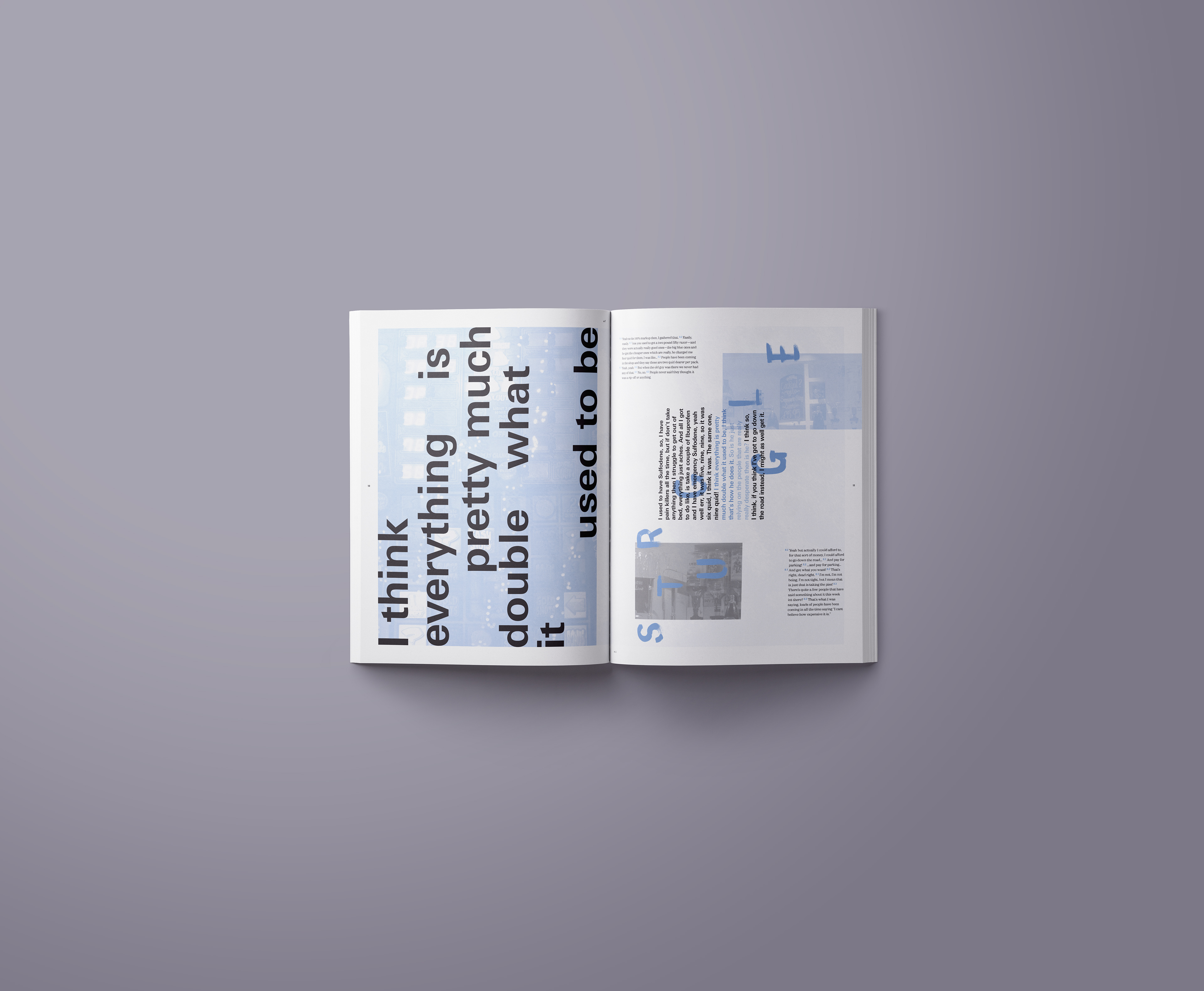
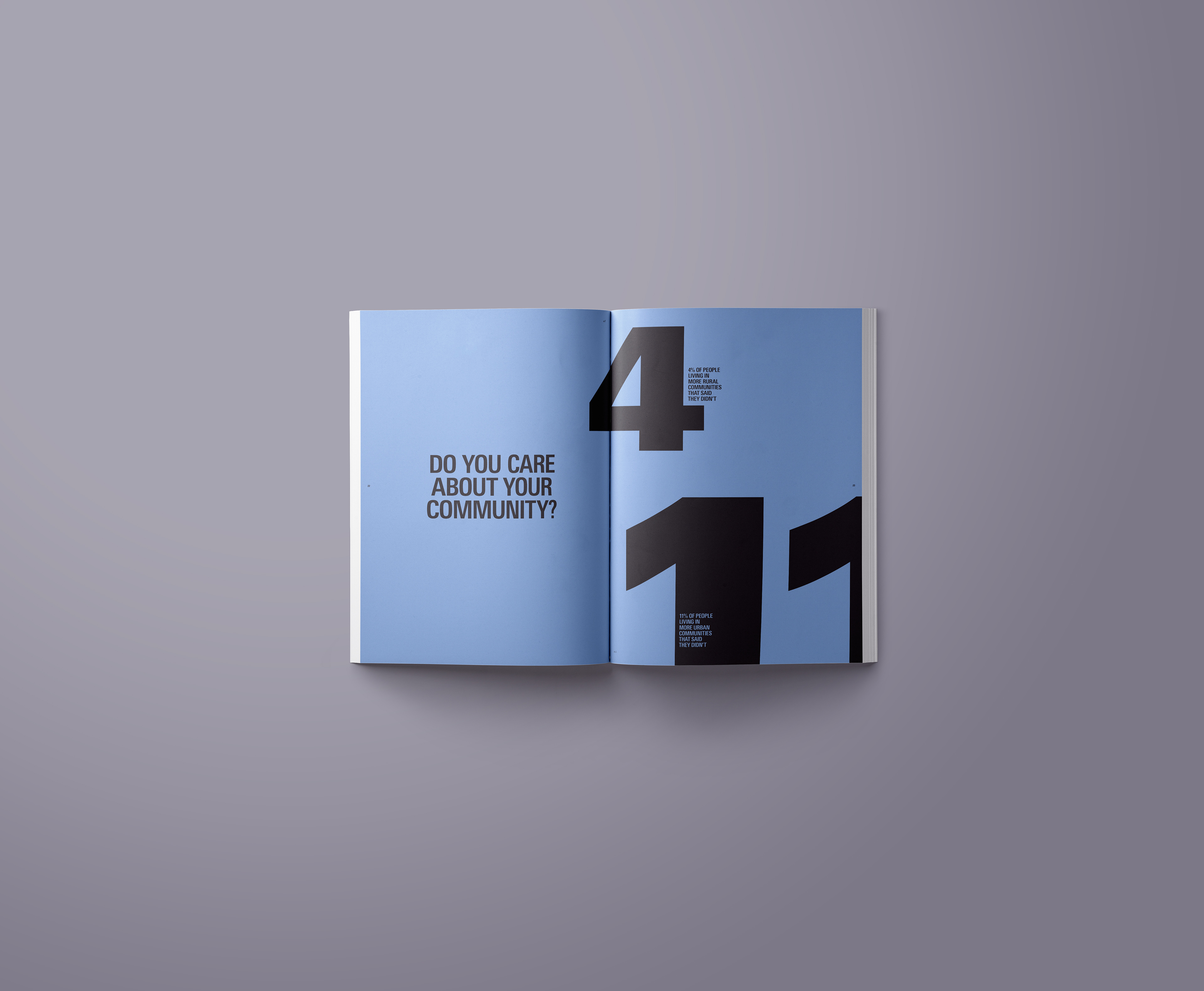
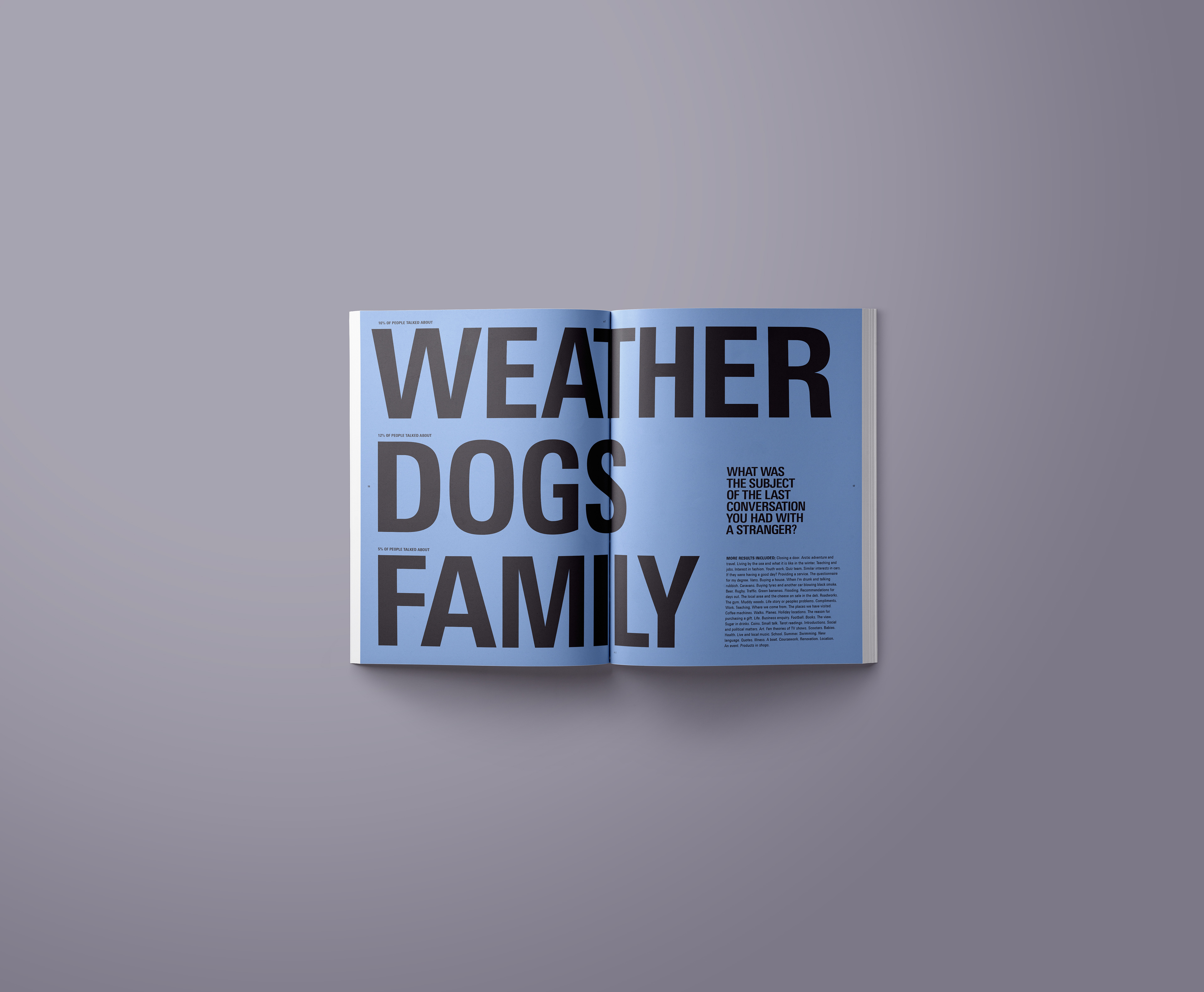
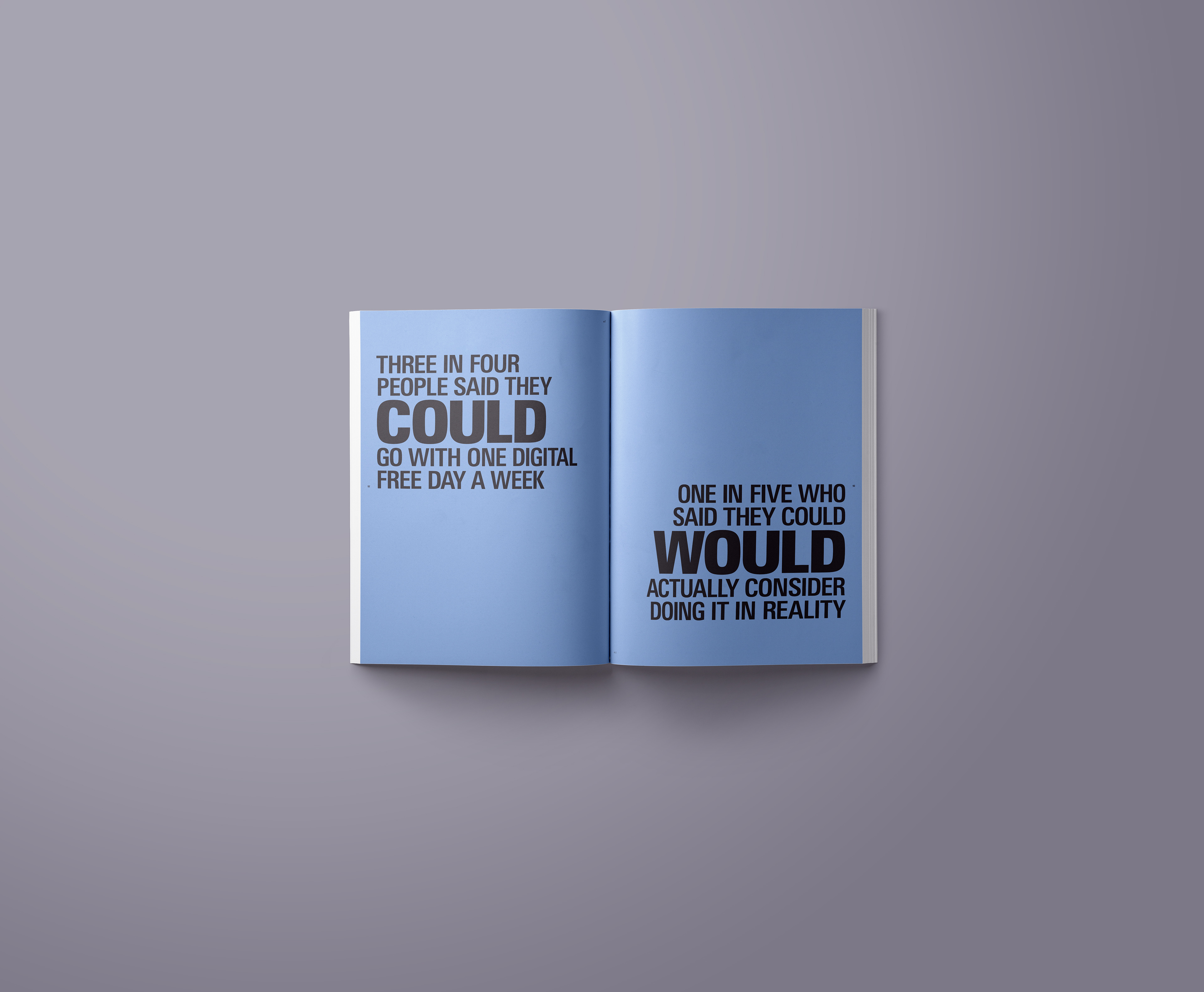
To go alongside the everyday conversations, Josh also surveyed a broad group of society to gain insight into their thoughts and feelings regarding community and communication. The results were then interpreted into spreads to communicate the information. The design of this information contrasts the conversations to stand out and act as a natural break.

Josh produced a range of postcards that were printed on a Risograph printer to go alongside his publication. The purpose was to allow people to collect them or as the journal encouraged, readers could share their thoughts and contribute towards the next volume of Social Fabric by posting them back.

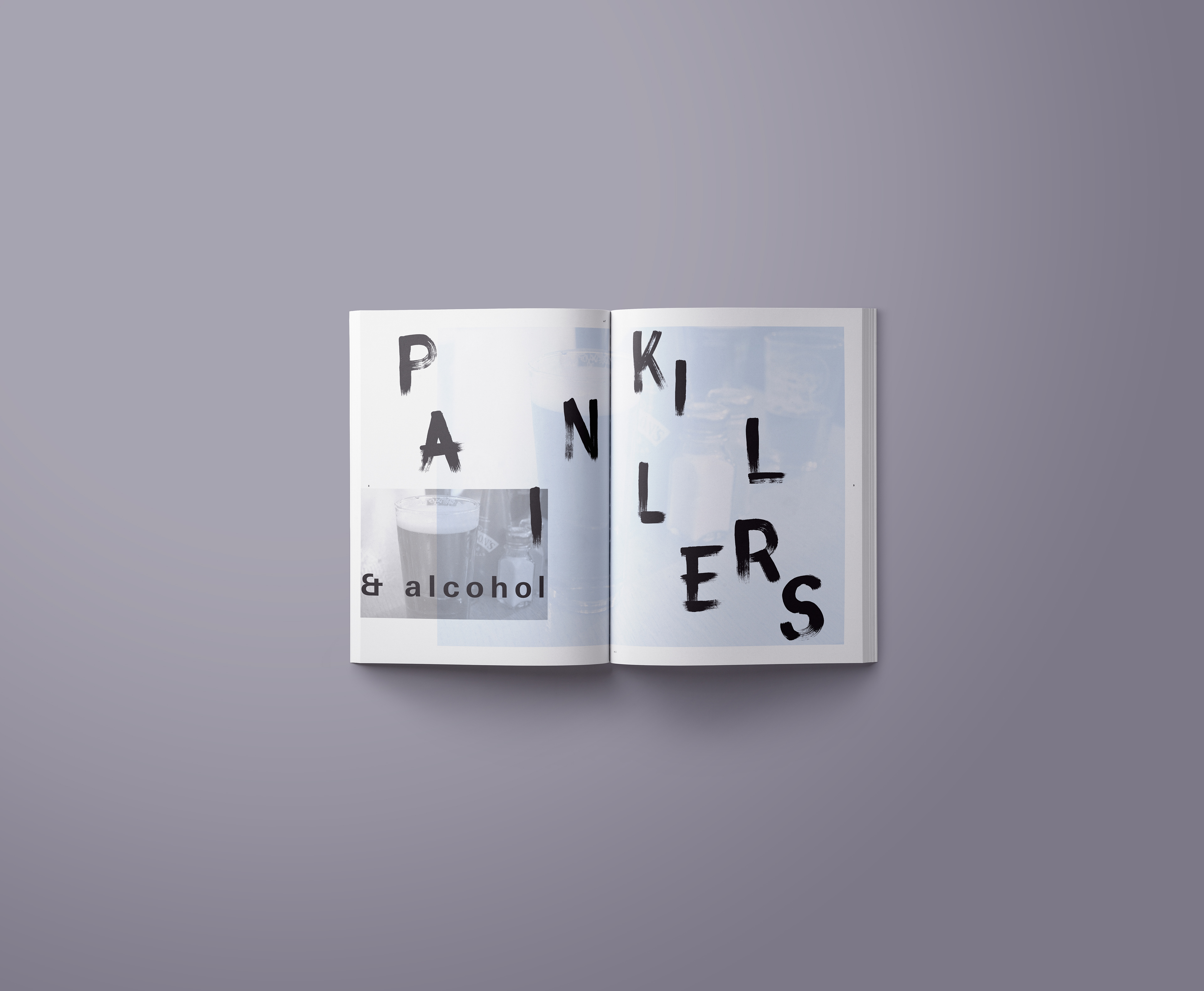
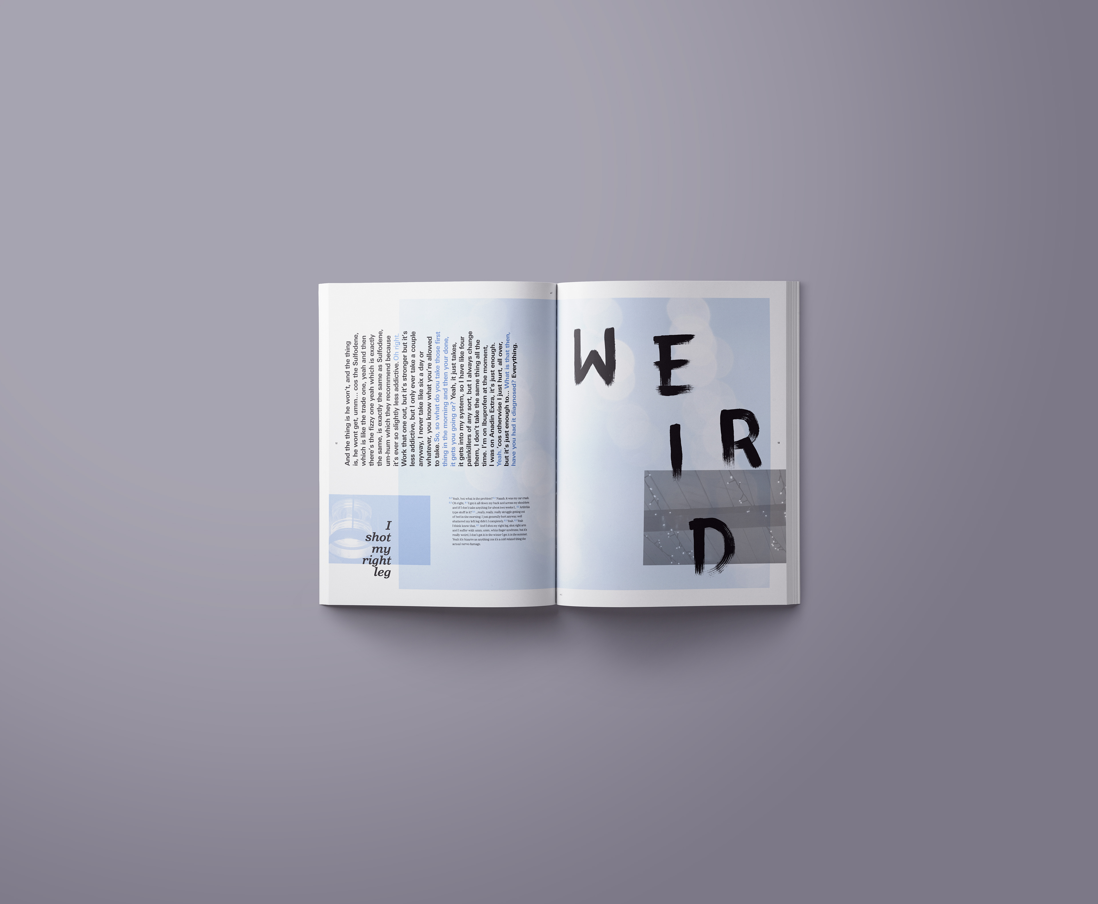
Josh created a naive hand drawn brush stroke typeface that contrasts the main copy to create a raw feeling, staying true to the intentions of the project. He also created a range of alternatives to reflect the inconsistencies of people's handwriting.